Microsoft’s CE&S Business Intelligence team manages data tools used by thousands of enterprise customers, but their CE&S BI Docs (Documentation site) and CE&S BI Hub (PowerBI report hub) platforms had grown increasingly difficult to navigate, creating heavy cognitive load and making it difficult for users to quickly locate reports or documentation.
Our team was tasked with redesigning both experiences by simplifying the site structure, improving report discoverability, and creating scalable documentation and design systems.
The result was a clearer, more intuitive platform that reduces cognitive load and helps users access key data and resources faster.
We had three final deliverables:
 | High Fidelity Prototype of CE&S BI Docs |
 | Mid Fidelity Figma Prototype of the CE&S BI Hub |
 | Design System for Webapps |
My Role
I served as a UX Designer and Project Lead on a student UX team partnering directly with Microsoft’s CE&S BI stakeholders.
In addition to owning core design work, I helped guide the team’s process and support younger students, ensuring the project stayed aligned, on track, and grounded in user needs. This role required balancing design execution, team coordination, and stakeholder communication, while helping less experienced designers build confidence and skills throughout the project.
Understanding the challenge
Across both platforms, users struggled to:
Find the right product, report, or documentation quickly
Understand acronyms and BI terminology
Navigate dense, text-heavy interfaces
Recognize system status or recover from errors
Build trust due to inconsistent visual and interaction patterns
Intended Users
Stakeholders had already defined three core personas who rely on the platform: Get Access users, Delivery Partners, and Internal Users. Each group interacts with the site for different reasons, but all depend on clear navigation and accessible documentation.
Get Access (External Users) – Temporary view for first time users or users that lost access to the reports.
Internal Users – Full-time Microsoft employees or internal vendors.
Delivery Partners – Outsourced delivery vendor employees.
Goals
Improve discoverability of products, reports, and resources
Reduce cognitive load in data-heavy workflows
Create a scalable design system aligned with Microsoft standards
Deliver development-ready designs for real implementation
Discovery Research & Insights
Key Research Methods
Heuristic evaluations (Docs + Hub)
Cognitive walkthroughs using sponsor-provided flows
Journey mapping for first-time vs returning users
SME interview on Microsoft brand & accessibility constraints
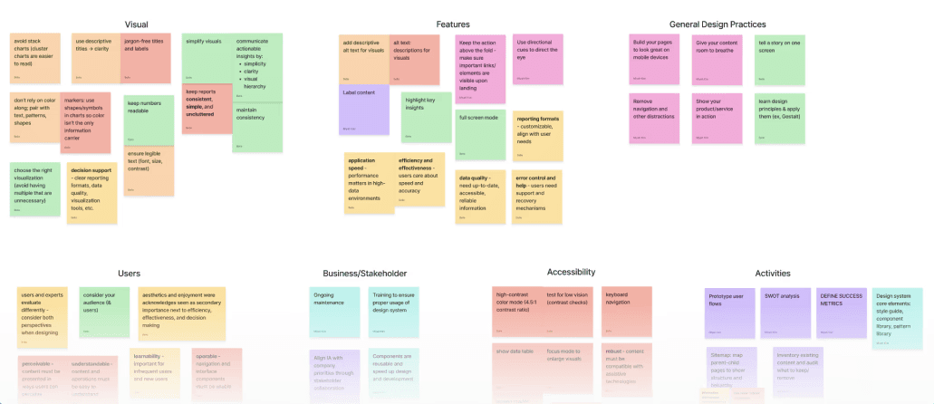
Core Insights
Users rely on recognition, not recall → dense lists failed them
Reports behave like files → folder-based mental models work better
Navigation inconsistency breaks trust → global patterns must stay stable
Visibility = confidence → if users can’t see reports immediately, they assume none exist
These insights directly shaped both redesigns.
Information Architecture
To better understand the current structure, we created a comprehensive sitemap of the existing site. This allowed us to visualize how content was currently organized and identify patterns of redundancy and fragmentation:
Using this sitemap as a foundation, we worked through several iterations to:
Identify duplicate or unnecessary pages
Consolidate related content
Clarify page hierarchy
Simplify navigation pathways
Reduce the total number of top-level navigation items
This process helped us focus on grouping content around user needs rather than internal organizational structures.
The new information architecture reorganized the site into five primary navigation sections, each representing a distinct user goal.
Primary Navigation
Page Title | Description |
|---|---|
Home / Landing | Overview of CE&S BI Docs, key value propositions, and entry points into major areas of the site. |
Products | Information about CE&S BI products, capabilities, and related documentation. |
About Us (CE&S BI Team) | Organizational information, mission, and team details. |
Get Access | Steps for onboarding, account authentication, and CE&S BI Hub access. |
Resources | Additional materials, guides, and supporting content. |
Upon further discussion with our stakeholders, we added a Services page with further information about available services and support offerings.

In addition, we introduced a standardized documentation page template to ensure that all documentation pages followed a consistent structure. This improves readability and allows users to more easily scan and locate specific information.
By consolidating redundant pages and clarifying navigation labels, the new structure reduces cognitive load and allows users to find information more quickly.
CE&S BI Docs Redesign
A clearer front door to the BI ecosystem
The Docs site acts as the entry point for clients, but its original structure buried critical information under dense text and scattered links.
What We Changed
Rebuilt the information architecture around user goals
Introduced a strong landing page with clear entry points
Replaced long text blocks with cards and visual hierarchy
Centralized FAQs and documentation into a dedicated Resources hub
Designed reusable templates for consistency and scale
Initial Sketches
Mid-Fidelity

Usability Testing
In order to validate our design choices and ensure smooth navigation of our prototype, we conducted usability tests with 4 college-level participants, all with no prior familiarity with similar tools in a scenario where they were an employee of a third-party company. We gave them 4 distinct tasks to accomplish with our prototype, evaluated their success, and took notes on their movements and thoughts.
Task | Success Ranking out of 4 |
|---|---|
Find out more about the team | 3.7 |
Find out which service would be best for your company | 2.3 |
Find answers to lingering questions | 2.7 |
Find out how to get into the Hub | 1.5 |
Design Validation
The average level of confidence users had in navigating the platform was a high 8.3/10. One also said that the design was in line with similar websites they’ve used before, indicating an alignment with industry standards.
Confusion About the Services Page
All users were confused by the contents of the Service page. While they were aware that this prototype did not have the final text, it was the only page where they could not understand what would be there.
Motivation to Scroll
Many users didn’t scroll down and fully explore each page to find information. “Nothing made me want to scroll down,” one user said, while pointing out that the main banner takes up the entire window.
With the mid-fidelity wireframes as a guide, we applied usability testing insights and stakeholder feedback to refine and iterate on previous designs of each page. The prototype incorporates consistent color tokens, typography, and spacing rules.
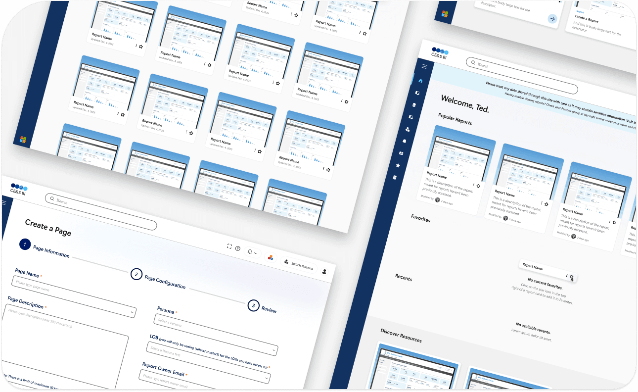
Final CE&S BI Docs Design
Landing Page

Products Page
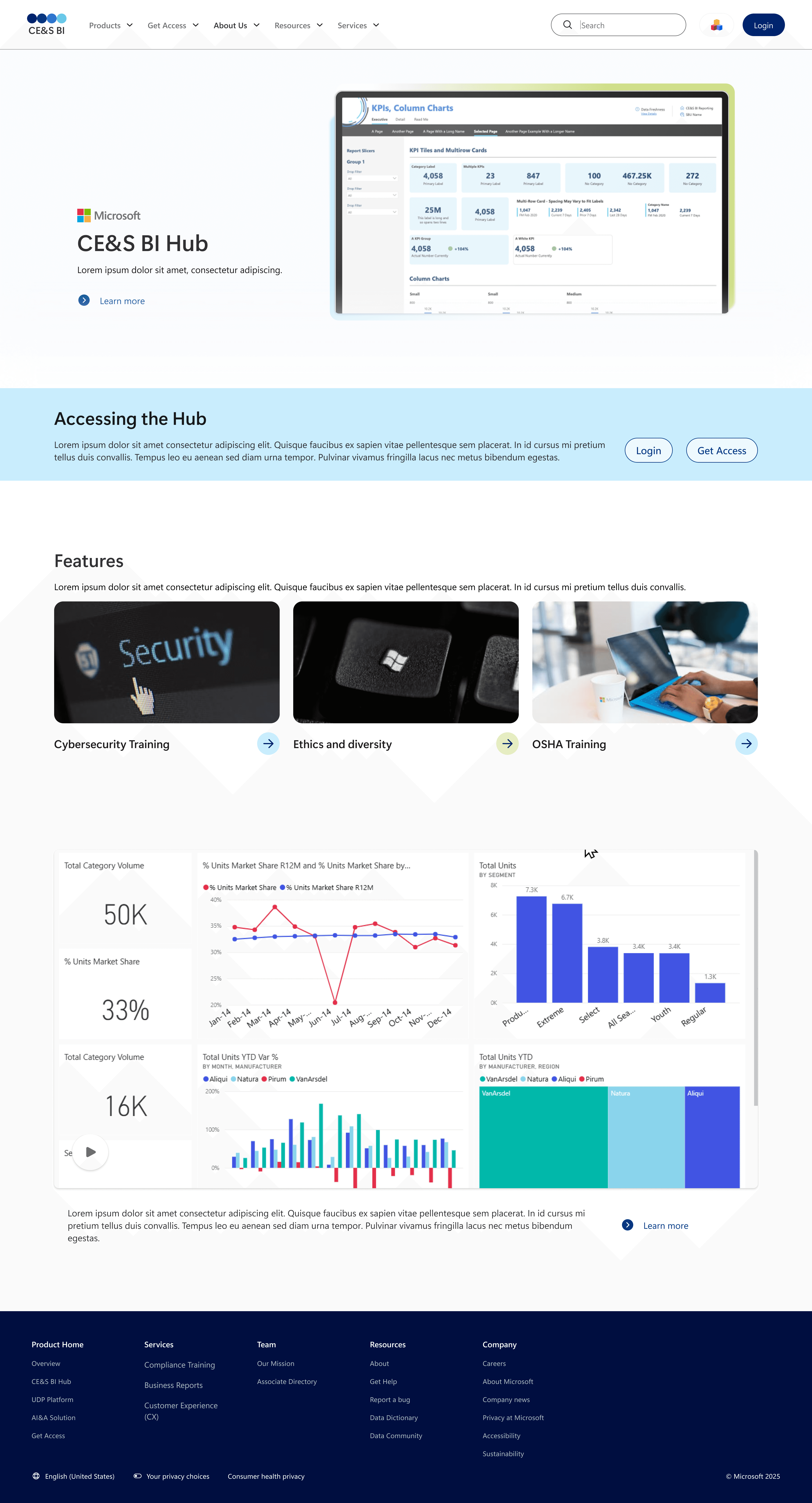
What We Accomplished
Users can now quickly understand:
What CE&S BI offers
Which products are relevant to them
How to get access or learn more
The experience feels modern, scannable, and aligned with Microsoft’s brand without overwhelming users.
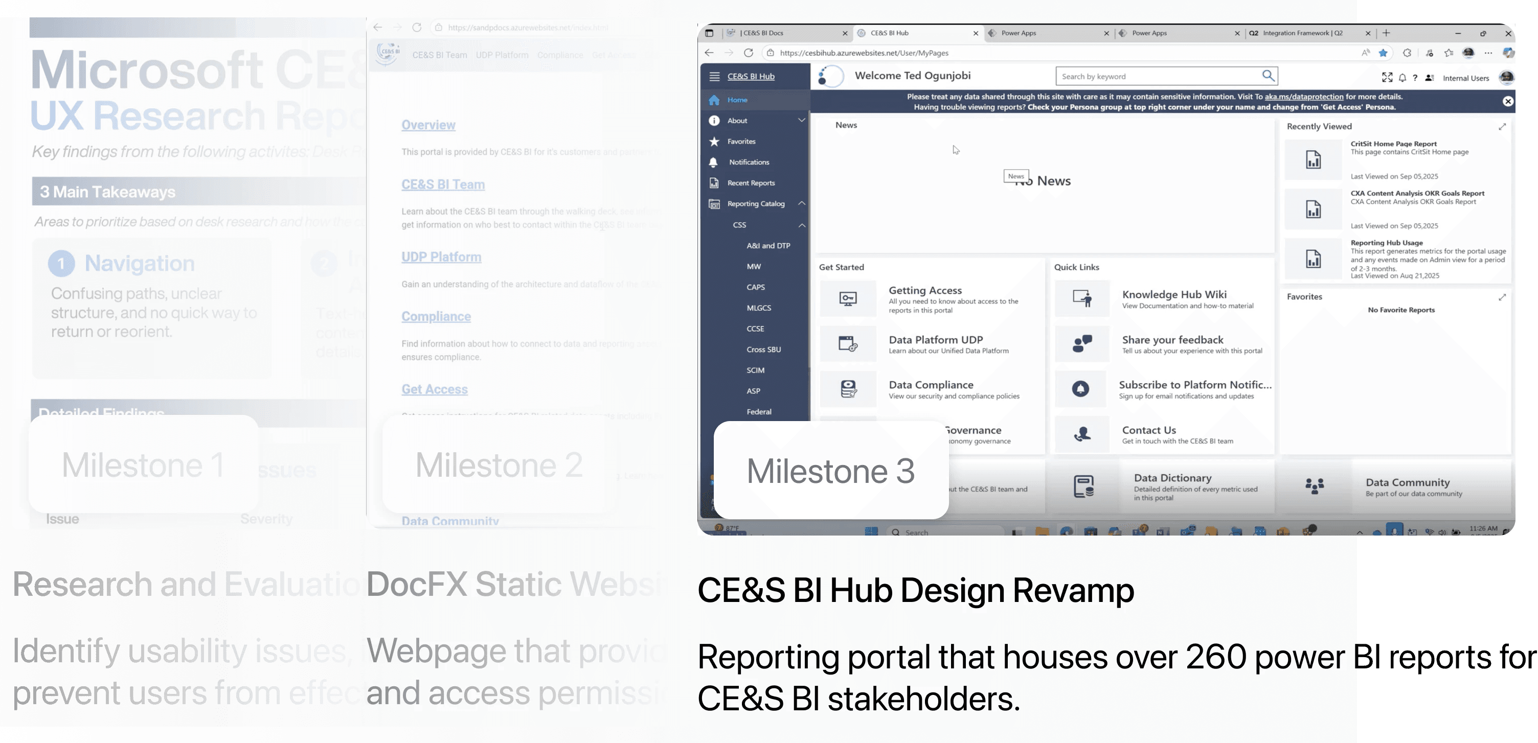
With the CE&S BI Docs experience redesigned, we turned our attention to the CE&S BI Hub, the central reporting portal for internal and external CE&S stakeholders.
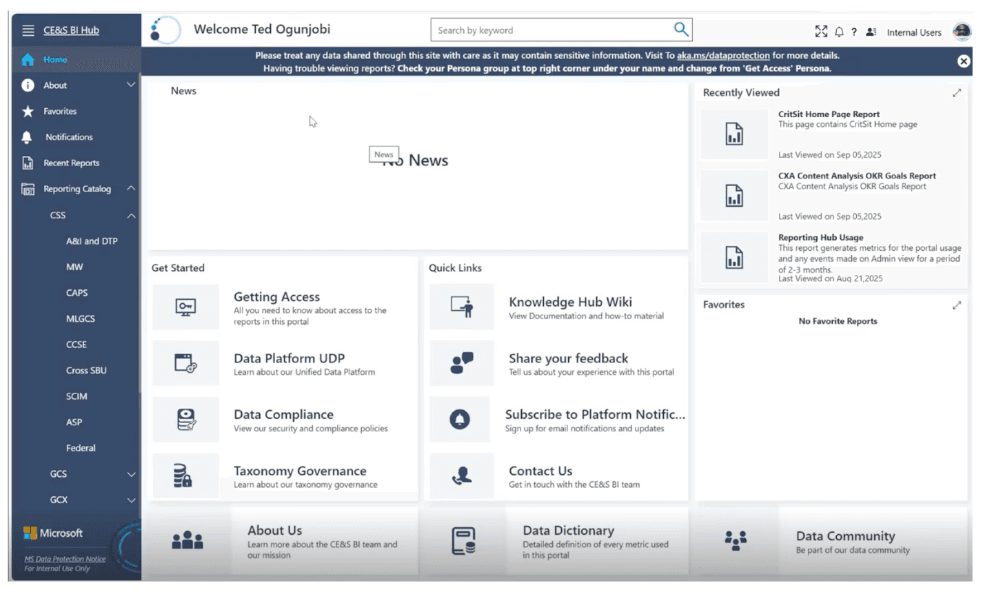
CE&S BI Hub
Faster access to reports with fewer steps
The Hub houses Power BI reports but originally required too many clicks and too much memory.
The Key Shift
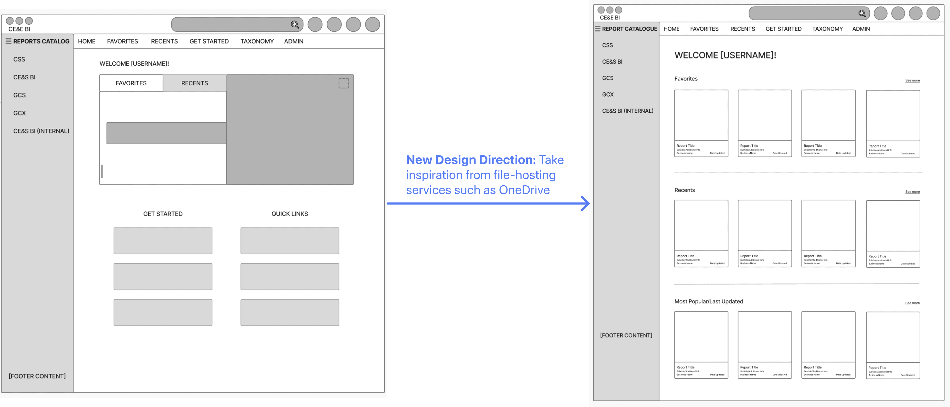
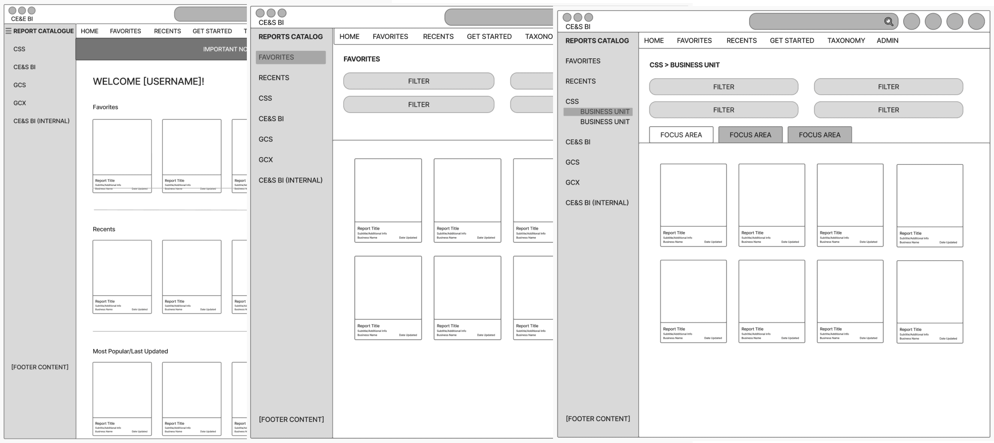
We redesigned the Hub dashboard around a file-based mental model, inspired by familiar tools like Microsoft Word and Google Drive.
What We Changed
Reports surfaced immediately on the dashboard
Favorites, Recents, and Popular reports prioritized by context
Dense lists replaced with visual report cards
Filters and tabs supported both browsing and targeted search
Navigation made consistent and visible by default
Report actions moved into context instead of global navigation
Initial Wireframes
To map out the dashboard experience, we created sketches and lo-fidelity wireframes in Figma to use as a foundation for components and features to be included in the high-fidelity prototype.
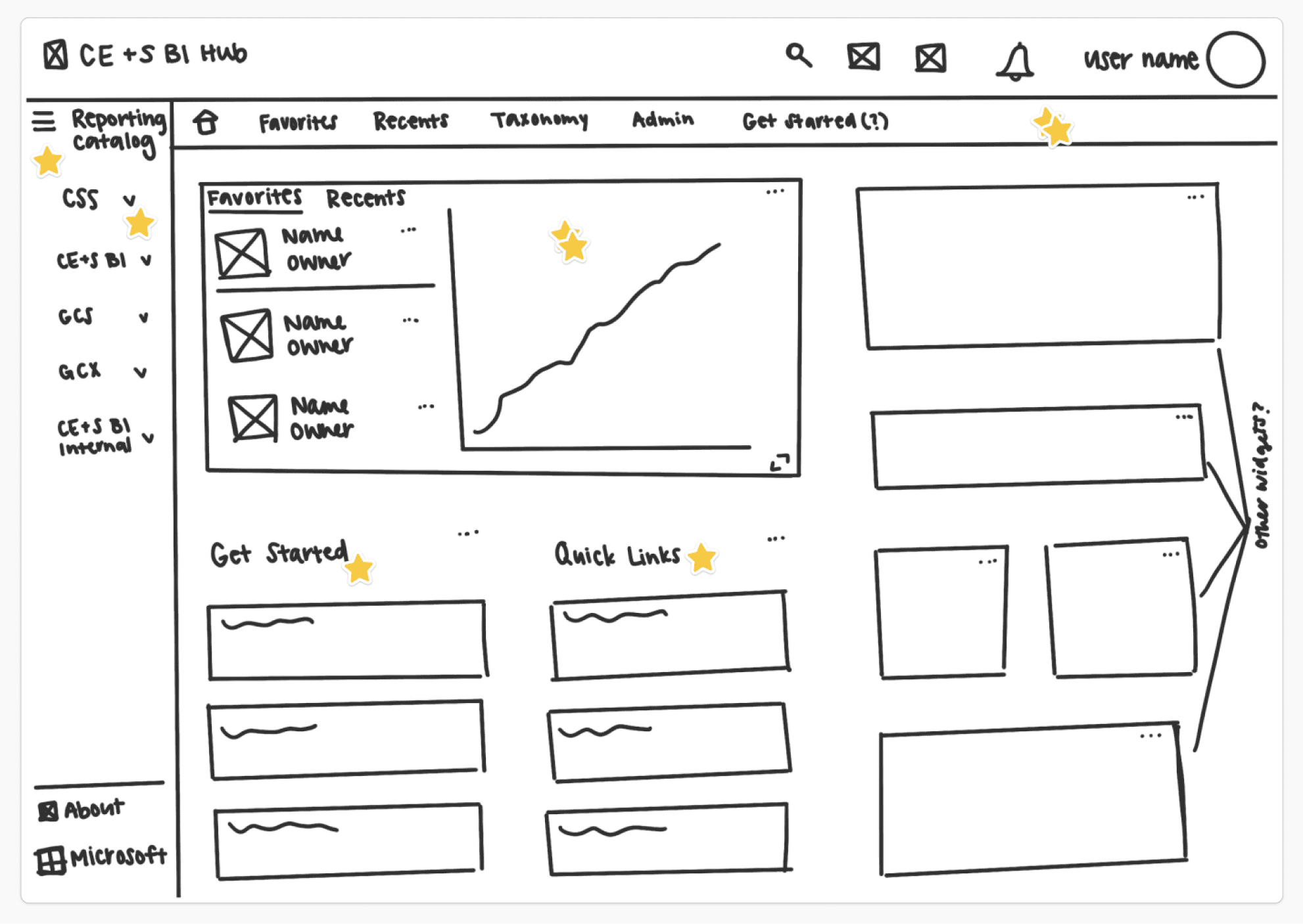
After cognitive walkthroughs with 3 internal users and an SME discussion with a usability expert, we found that for all users, viewing reports is their main goal when visiting the CE&S BI Hub. The current state takes about 5 clicks to view a report, so we took a new design direction:
Usability Testing
In order to validate our design choices and ensure smooth navigation of the Hub, we conducted usability testing on our mid-fidelity designs with 5 participants ranging from ages 17 to 31 and no prior experience with similar tools in a scenario where they were an employee of a third-party company.
Design Recommendations
Increase visibility of the reports on the New User Homepage
Because reports are not immediately visible to new users, many assumed that there were none on this page and did not scroll down to see them. From
Correct the inconsistent and misleading language on the New User Homepage.
Users found the language used was confusing.
Make the sidebar expanded by default.
Many users did not realize that they could expand the sidebar. This led to a lot of confusion as they tried to guess what each of the icons meant.
Overall usability testing showed that many of our core design decisions were moving in the right direction, especially for users who were familiar with navigating file based systems. Participants were generally able to complete tasks related to finding and saving reports, which suggests that the overall structure of the Hub is understandable.
Original CE&S BI Hub Dashboard
Final CE&S BI Hub Dashboard Design
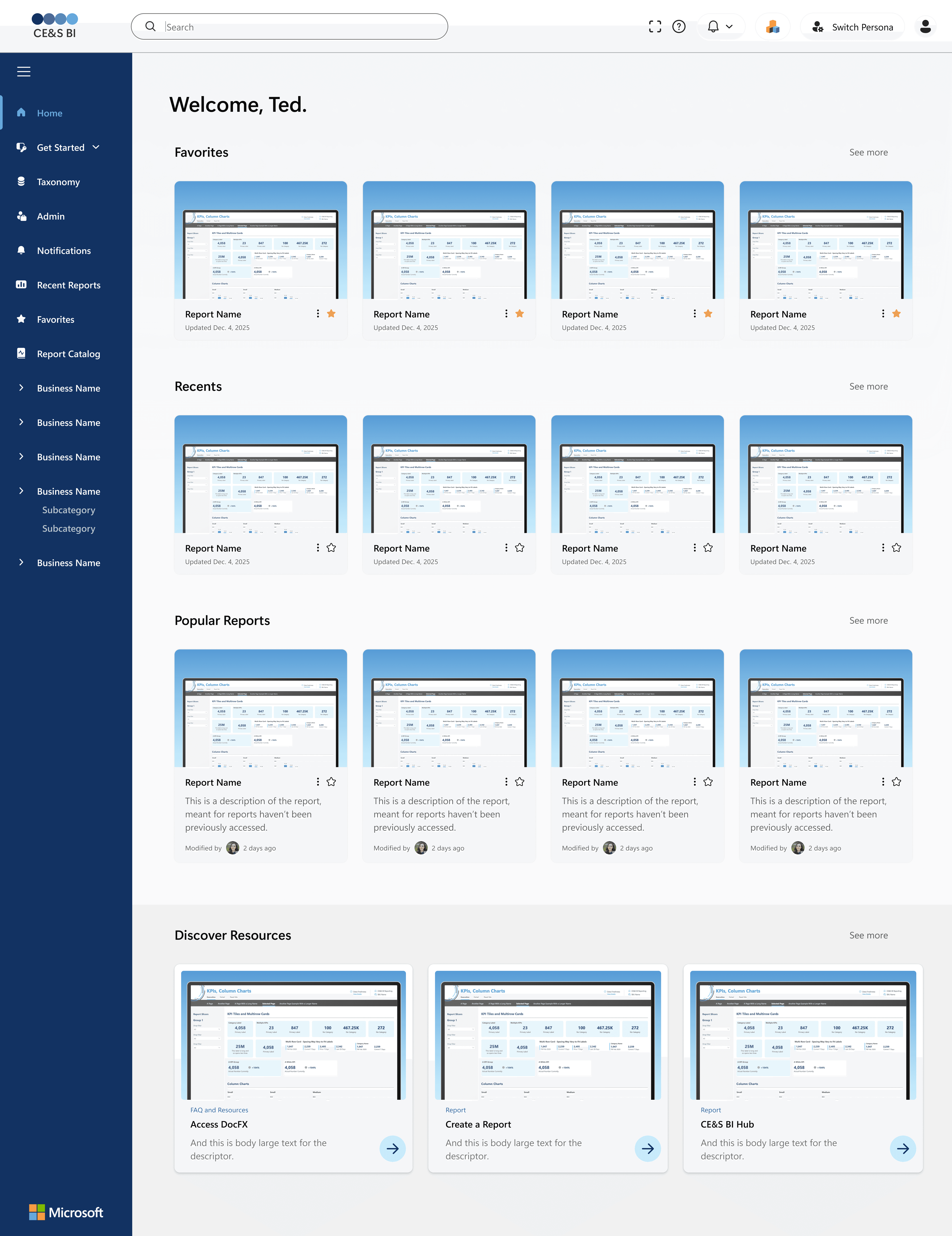
What We Accomplished
Reports can now be accessed in as little as one click
Users scan visually instead of decoding metadata
First-time users feel oriented; returning users stay efficient
Design System & Scalability
To support long-term growth, we created a shared design foundation across Docs and Hub:
Token-based color, typography, and spacing
Reusable components and layout patterns
Accessibility-first decisions aligned with WCAG standards
This ensures the platform remains consistent, even as new features and teams are added.
You can view the CE&S BI Docs & Design System prototype -> here
Our work has been implemented by our Microsoft stakeholders through development, and is delivering real impact for users 🌟
What I learned & What's next
This project reinforced that strong enterprise UX prioritizes clarity and key tasks over cleverness. Familiar patterns often do more to reduce friction than novel interactions, especially in data-heavy systems. It also emphasized that research only becomes valuable when it clearly informs design decisions, rather than existing as a separate artifact. Finally, designing with scalability and handoff in mind isn’t optional. It’s a core responsibility when working on systems meant to grow beyond a single team or semester.
Next steps include advancing the CE&S BI Hub designs into high-fidelity and testing them with real CE&S BI users to further validate our decisions. Continued refinement of language, especially around acronyms and BI terminology, would help reduce confusion and better match users’ mental models. From there, supporting development handoff and iteration will be key to ensuring the designs translate effectively into a live product.