Client Background
Living Proof is a science-backed haircare brand founded by MIT scientists and professional stylists, built on solving “tough beauty challenges” through technology-driven formulas. Our team partnered with Living Proof to evaluate their website experience and identify ways to help new customers find the right products faster, feel more confident in their choices, and ultimately add more to cart.
The Problem
For college-aged women who are new to Living Proof, the website experience looked polished—but the path from “I’m curious” to “I’m confident enough to buy” had friction.
New users often:
missed key brand messages (especially the science-backed differentiation and silicone-free positioning)
relied heavily on the Shop menu while overlooking other discovery methods
felt overwhelmed by product information when trying to decide
didn’t notice promotions or free sample incentives (banner blindness)
struggled to understand unfamiliar terminology such as “auto-replenish”
This made product discovery feel less intuitive and product decision-making more effortful than it needed to be—especially for first-time customers who weren’t yet loyal to the brand.
My Role
I was a UX researcher and designer on a cross-functional student team. I contributed to brand perception research, protocol writing, usability testing support, heuristic evaluation analysis, and design iteration in Figma. I helped translate findings into specific, testable recommendations and mockups across the homepage, PLP, PDP, and checkout experience.
The Goal
We focused on one guiding question:
How might we improve the Living Proof desktop experience for new users to enhance product discovery and decision-making in ways that maximize customer cart value?
We intentionally targeted desktop because research showed users preferred browsing and purchasing on laptops for higher-confidence purchases (tab comparison, larger visuals, and a “more secure” checkout feeling).
What We Did
This project was research-heavy by design. We combined brand analysis and competitor benchmarking with multiple rounds of evaluative testing to find patterns that held up across methods.

We conducted desk research on Living Proof’s brand perception, ran a competitor comparison of discovery and retention strategies, and observed how new users navigated the site through talk-aloud walkthroughs. From there, we used heuristic evaluations and usability testing to validate pain points in both product discovery (PLP + search) and product decision-making (PDP + checkout). We then synthesized everything into a current-state journey map and used it to guide low-fidelity iteration and mid-fidelity mockups.
Key Insights
New users trusted Living Proof—but didn’t fully understand why.
Participants described the brand as professional and “healthy,” but the scientific differentiation wasn’t coming through strongly at first glance. Benefits often felt buried, which weakened the brand’s strongest credibility lever.
Discovery happened through one path: the Shop menu.
Most users defaulted to the Shop navigation and overlooked other discovery tools (like the Hair Quiz), either because they assumed they already knew their hair type or because the site didn’t make alternative paths feel equally valuable.
Promotional value was easy to miss.
Decision-making was slowed by heavy content and unclear terminology.
Instead of proposing a full redesign, we created a set of targeted improvements across the discovery-to-checkout journey—focused on making the site more legible for first-time users, while also supporting conversion and cart growth.
Our final deliverables included a site evaluation (where methods validated or contradicted one another), a prioritized list of recommendations, and mid-fidelity mockups showing how those recommendations could look in practice.
Design Recommendations
Homepage: make value + discovery obvious above the fold
Our homepage redesign focused on reducing “first impression skew.” We increased the visual weight of campaigns and key brand messages to address banner blindness, and added more product discovery touchpoints that make it clearer how to start shopping. We also introduced a message strip that surfaces Living Proof’s top priorities early—science-backed, silicone-free, and performance-based results—so users don’t need to hunt for credibility.
PLP: shorten the path to adding products
In the original PLP, users couldn’t quickly add items to cart and pricing lacked clarity when products had multiple sizes.
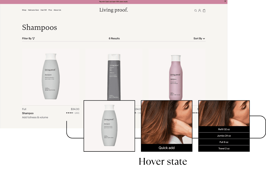
We recommended a more balanced product card layout with clearer price/size communication and a “quick add” interaction that allows users to choose a size and add to cart directly from the PLP. This reduces effort during browsing and supports higher cart-building momentum.
PDP: help users decide faster with clearer hierarchy
On PDPs, we reorganized content to surface what new users look for first: key benefits, quick access to reviews, and clearer ingredient messaging.
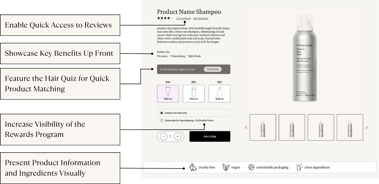
We also pulled the Hair Quiz visibility earlier on the page (even though the quiz itself is third-party) to support product matching without forcing users to scroll or leave the PDP. The goal was not to add more content, but to make the right information easier to find when it matters.
Checkout: make incentives feel real (and visible)
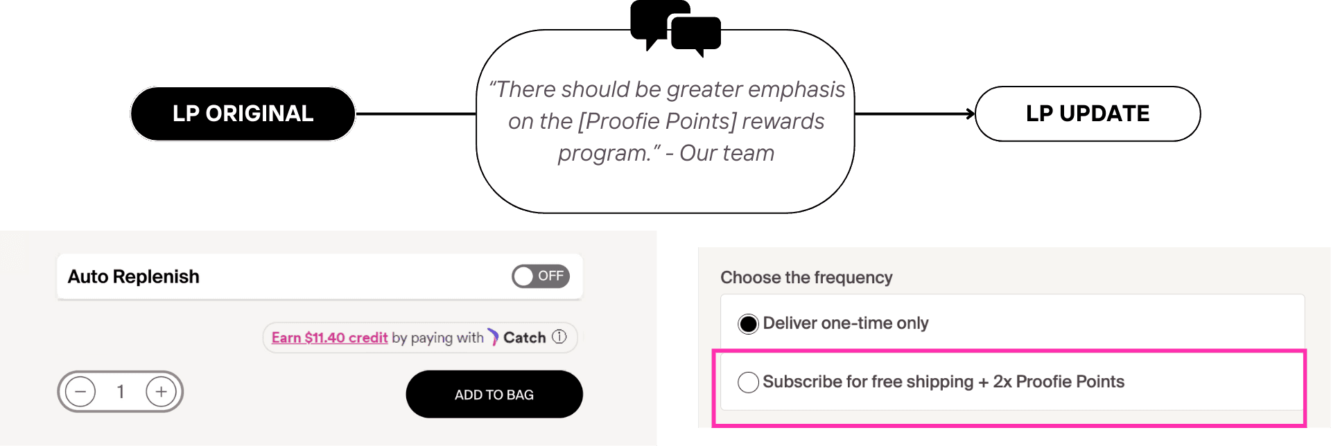
At checkout, we redesigned the free sample experience to eliminate ambiguity. Instead of requiring users to proceed further to learn whether they qualified, the experience clearly communicates the threshold and how much more the user needs to spend to unlock samples. This solves the “I didn’t know that was an option” problem and turns incentives into an intentional nudge for cart value. We also reduced cognitive load by simplifying promo code and receipt sections and recommended reinforcing Proofie Points near checkout to support retention.
Impact
Our mockups made recommendations concrete and testable, helping Living Proof visualize how small UX changes could improve discovery, decision-making, and promotional clarity for first-time users. During the semester, Living Proof also shipped iterative site updates, some of which aligned with our recommendations, such as increased visibility of Proofie Points on PDPs. This validated that the opportunity areas we identified were both relevant and feasible within an active product environment.
Constraints & Decisions
One important scope decision was around the Hair Quiz. Because the quiz is built and controlled by a third-party vendor, we aligned with Living Proof that our work would focus on recommendations rather than fully redesigning the quiz experience. This allowed us to stay grounded in what was actually implementable while still acknowledging the quiz’s role in product discovery.
What I Learned
This project reinforced how easily brand credibility can be lost, not because the brand lacks credibility, but because the interface doesn’t surface the “why” at the right time. It also showed how valuable it is to triangulate findings across methods: banner blindness, unclear incentives, and content overload appeared repeatedly in different forms, which made our recommendations stronger and easier to justify. Finally, working alongside a brand whose website was actively evolving taught me how to design recommendations that are both aspirational and realistic.
